How to Create a High-Converting Landing Page in Wix Studio (2026)
A landing page is the most focused piece of real estate on your website — one offer, one audience, one goal. Wix Studio gives you the tools to build one that actually converts, but only if you know which settings matter and which ones to skip.
Here’s how to do it right.

What Makes a Wix Studio Landing Page Different from a Regular Page
A landing page serves a single purpose: get a visitor to take one action. That might be signing up for a free trial, downloading a lead magnet, booking a consultation, or buying a product. Unlike a homepage, which points visitors in several directions, a landing page strips everything else away.
In Wix Studio, this distinction matters because you’ll build landing pages with fewer menu links, no footer distractions, and tighter layout constraints than a full site page. Wix Studio’s section-based editor is genuinely well-suited for this. You can control every pixel of each section, set per-section backgrounds, and adjust spacing independently without fighting a template.
Start With the Right Foundation
Before you drag a single element onto the canvas, decide your entry point:
Use a Studiorra template if you want a pre-built landing page with a proven layout. A well-designed template eliminates the bulk of design decisions upfront and typically converts better out of the box than a blank page built from scratch.
Start from a blank section if you need a fully custom layout or you’re building inside an existing site. Wix Studio’s AI layout assistant can generate a rough section structure you can then refine.
Either way, set the page to use a minimal header or none at all. Navigation menus pull attention away from your CTA — remove them from the landing page unless your audience specifically expects them.
Build Above the Fold First
The section visitors see without scrolling is the most valuable piece of your landing page. It needs to do three things in under five seconds:
Tell them exactly what you’re offering
Show them why it matters to them
Give them a clear next step
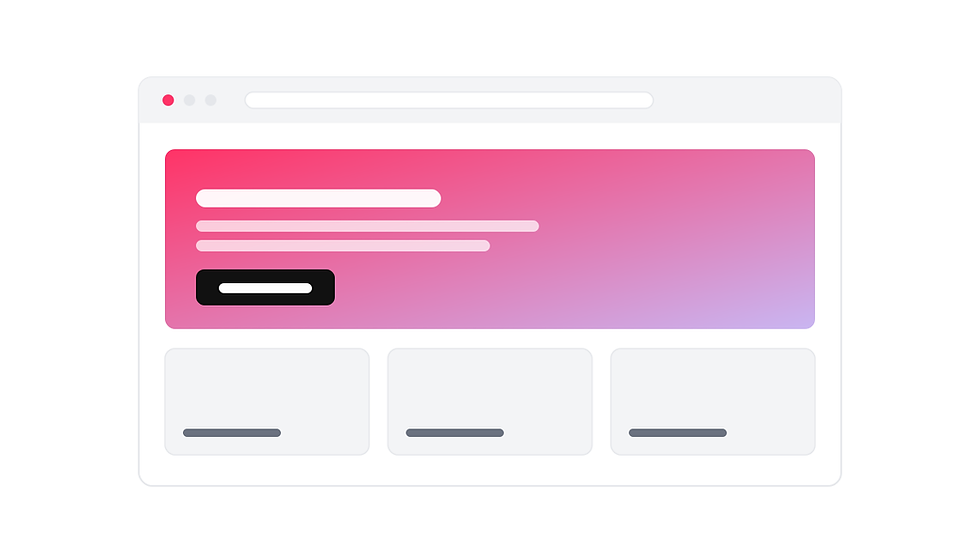
In Wix Studio, place your headline, sub-headline, and primary CTA button all within the first section. Keep the headline to one or two lines — if it wraps to three lines on desktop, trim it. Use a contrasting button color (Wix Studio lets you set global design tokens so your brand color is consistent everywhere) and put the button text in active language: “Get Free Access,” “Book My Call,” or “Download Now” outperform “Submit” by a meaningful margin.
Don’t add a background image just because you can. A clean, high-contrast hero with text and a button often converts better than a busy photo behind a dark overlay.
Add a Lead Form That Doesn’t Scare People Off
Wix Studio includes a built-in form element that connects directly to your Wix CRM. For most landing pages, you only need two fields: name and email. Every extra field you add drops completion rates.
Set up the form’s success state to show a thank-you message or redirect to a confirmation page — not just blank silence. The post-submission experience matters for trust and follow-through.
If you’re running paid traffic to this landing page, install the Meta Pixel through the Wix Marketing Integrations panel. Track form completions as conversion events. You cannot optimize your ad spend without this data.
Use Breakpoints to Make It Mobile-Ready
Over half of landing page traffic arrives on mobile. Wix Studio’s breakpoints let you set separate layouts for desktop, tablet, and mobile rather than relying on auto-scaling. Take advantage of this.
For mobile, focus on four changes:
Stack columns vertically instead of side-by-side
Increase font sizes slightly — 16px minimum for body text
Make the CTA button full-width so it’s easier to tap and looks intentional
Hide decorative elements that add load time without adding value
Switch to mobile view in the Wix Studio editor and walk through the entire page before publishing. Small layout issues that look fine on desktop can completely break the mobile version.
Speed and Pre-Publish Checks
A landing page that loads quickly converts better. Before you hit publish:
Compress images and use WebP format where possible. Wix Studio’s image uploader will flag oversized files.
Turn off unnecessary apps. If you have a live chat widget or pop-ups on the main site, check whether they’re loading on the landing page too. Exclude the page from any rules that don’t apply to it.
Set the page SEO title and meta description. Even if you’re running paid traffic and not targeting organic search, these fields affect click-through rates when the page is shared or previewed.
Test the form submission yourself. Submit the form and confirm the contact appears in your Wix CRM inbox before driving traffic to the page.
The Fastest Way to Get a Great Result
Building a landing page from scratch in Wix Studio takes time — designing sections, choosing fonts, setting spacing, testing on mobile. A well-built template cuts that work dramatically. The layout decisions, font pairings, and spacing have already been tested and refined.
Browse the full template library at studiorra.com/templates — each template is built specifically for Wix Studio and ready to drop your content into and publish.

Comments